Sunday, July 31, 2011

Funny Ditty

I was reminded on the weekend about my first (and only) TV appearance.

And because sharing is caring - here I am, warts n' all.

No make-up, 14 weeks pregnant and no formal acting training - just warning you, it was 8 years ago!


The skit was from a series here in New Zealand called Moon TV.  It was the early days... Say no more.

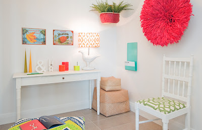
Investigating: Colourful Apartment

This image caught my eye from the latest Homestyle Mag.


I wanted to know more...

Turns out it's a "designed" apartment by Touch Interiors.  

I must admit it made me a little sad to think that it's not a real home.  Saying that you can buy everything here via their website.

What do you think?


Pro's:
Stripe carpet
African beaded Chairs
Lime, teal and orange accents
Painted latice side-table
Mixture of patterns with fabric

Con's:
Spraying Parrots everywhere
Driftwood accessories (mirror and pots)
Vomit coloured floor tiles

Must say the initial shine not so shiny.

Wednesday, July 27, 2011

Good Prod: Sawan Pestle and Mortar

OMFG this is beautiful.  

You can buy this from Gretel Home

This product caught my eye on the Oh Joy blog

The colour, the form, the shiney-ness...

Designed by Tahir Mahmood - It is made from Sissoo (a wood native to India) using the age-old technique of lathe turning in Pakistan and is finished with brightly colored resin.

Fantazzy.

Friday, July 22, 2011

Come on in: Alex Fulton's Home (that's me yo)

I'm no good at keeping secrets but I can finally reveal that the photo-shoot at my house was for Homestyle Magazine out NOW!

Just 'cause you are specsh to me, I will give you added extra info that you will NOT find in print.  Go out and buy too because this issue is jam-packed with colour (mostly).

Yes that's my living room - how funny.  It's sound-proofed to hold an annual dance party and also where I cut my toe nails.  See...extra info.  So worth it.

All images photographed by the uber talented Lisa "Lumo" Gane

Wanna see what it looks like with-out the puuuurrrity words?

Dark navy carpet I love - but for the love of christ please avoid a white dog.  Lucky, I'm a virgo with a slight obsession with vacuuming.

All very exciting and a little daunting seeing all your wares splayed in print - but kinda cool too.

Lucinda (the editor) came and interviewed me with Alice (art director), and Lisa Gane from LUMO (photographer).  It was a fun couple of days - the hardest part keeping was keeping with continuity and wearing the same outfit twice in two days (who does that!).

Anyway - here I am in all my glory.  House in all.

The stairs basically are the first idea I had for the renno.  It all went up hill from there. 

The blue paint idea was partly because of the damage that recent earthquakes did to our home.  Paint covers ALOT.  The other part was basically I had a thang for that blue.

Enjoy a good nosey around.


Some extra shots from Miss LUMO


Extra's also in the mag included:

* getting to name my favourite 3 blogs (wanted to name so many more - sorry!) 


With so many talented design mother brothers (I now call family) it was very hard to choose just three, but I did and thank you all for your creative boosts you offer everyday.

* working with my good friend, and designer-in-arms, Charlie (Charles) Hudson on a couple of crafts ideas.

Alice "cheeky chops" Lines took this photo of Charlie and I putting up the tartan bunting - I say 'cheeky' as I didn't  include the overwhelmingly flattering (or I should say 'fattening') shot of my rear.  Stick to the art direction Big A.

Our "how too" guide on bunting (Charlie is the bunting-queen) and embellishing a tea-towel to make art (again mostly Charlie - I was chief stylist and good-bitch).

* featuring the work of my favourite "deliciously obsessive" Obsessilious and his prints (good timing Griffo!).  I didn't have time to get them framed but once the editor saw them she said she just HAD to feature them.

Best "get the look" ever!  
Fabric from Bolt of Cloth and UNIQUE fabrics


Pillowcase and ceramics from Flock Design Shop (Thanks Emma for loaning me some stuff and having no idea where it was going and when it was going to be returned, not that I returned anything, just brought it all as I was already "in love" with it all)


Magis Dog from ECC Lighting, Melamine plates from Douglas and Hope


Paint from Dulux (again thanks to Grace for not asking and just accepting that colours I choose are not usually from the recent release or trend file)


Eddie the dog from Dogwatch - Charlie dressed him in a blue ribbon which he thought suxed but didn't say a word.  Get that dog an agent I say.

And last but by NO means least, my newly acquired (I WON THEM BITCHES!) prints from Yumalum (a.k.a Obsessilious, Griff68, Bitchinetc).  Love ya man.


Go out and buy if you are in Na Ziland (NZ).

I say, good on Lucinda and her team for punching higher and adding some colour into their magazine.  My home may not be everyones cup of tea but I'm the one living here and I love it.


Thursday, July 21, 2011

Twins: Tim Webber vs. UM project

Just spotted over at Fancy! - the new range of goodness from local lad Tim Webber.  His new range is based on using metal and wood to form darn good design.

New range shot by photographer Simeon Patience
I rate..highly.


This wee stool did remind me of these...


Milking stools from UM project.

Same same but different which is cool man.  Just saying.

You can buy Tim Webber's new range from Bo Concept.


Tuesday, July 19, 2011

History lesson: Raymond Loewy

I saw this image and I immediately went into detective mode.


Intrigued, I dug around the shifty under bowels of the interweb and found out the following:

Designer:  Raymond Loewy, The Father of industrial design.

This dude is serious.  Check out his bio:
Life Magazine recently selected Loewy as one of the 100 most influential Americans of the twentieth century. 
Loewy is best known for such American design icons as the Coca Cola bottle, Air Force One, Lucky Strike, Greyhound Bus, Exxon and Shell logos, NASA interiors for Sky Lab and the Space Shuttle along with the Avanti, the only automobile to be exhibited in the Louvre.

Ya.

Some of the better known companies who sought his influence included Revlon, Faberge, Vogue, Harpers Bazaar, Hanes, Levis, Butterick, Bulova, Omega, Mont Blanc, Seth Thomas, Rosenthal, Wyeth Furniture, Frigidaire, Formica, Koehler, IBM, Saks Fifth Avenue, Macy's, Thalhimer's, Bloomingdales's, Ford, GM, Chrysler, Studebaker, BMW and Jaguar.


Word.

This is him.  Smooth cat.


Image from his official website


His favourite colour is black, beige and gold, he was friends with Frank Sinatra, and his eyes were blue (godda love the interweb).


Still, I like his furniture best.


Image from 1st Dibs - They reckon this is only a homage so only $3995 USD


Now this is the real dealio (From Christies) priced at $14000 (USD).  A good heads up my Northern Hemi friends if you see on of these at a trift store or yard sale.  Snatch that mother up.


If you want to purchase any of this furniture it will set you back a lot of moola.  Apparently too, the pieces were very heavy and therefore not widely distributed (i.e. probably NEVER seen in our tiny islands of NZ).  Oh well.  Thanks anyways Raymond, first and last seen on Pinterest.


Monday, July 18, 2011

New Product: Gecko in a box

Fabric that sticks to pore-free surfaces... tick.


Gecko in a box is just that.  


Many designs and patterns to suit kiddies to adults.  


Yet another way to stick shiz to walls and windows.  Admittedly it's pretty funky shiz.


Being so new and snazzy, I have heard wee whispers that you can get it here in NZ but will have to follow-up that one up.  James Dunlop me thinks.  The first time I spotted it was at DesignEX in Melbourne and is from the Creation Baumann team.

The multiple hats of me

My multi-hats are on.

Running a design business.

Looking after children (school hols have started).

Art maker.

Blogger.

I even paid a bill twice (Memory loss high).

Sweated up a storm

All before lunch.


Canvas covered in Marimekko Lokki by me.  Fabric sourced from Fe at Global Piece

Go me.

Hmmm what to do this afternoon.  A spot of world peace?  More likely the toilet needs a scrub.

Sunday, July 17, 2011

Spotted: CHANA fabric from Jim Thompson no.9

Recently I was shown this fabric (Opus Range) from the new Jim Thompson family - No.9.


Ever so fun and versitile I just keep thinking of uses for it.

Images from Peak of Chic Blog

Called CHANA after the indian chickpea it has a wee "ikat" edge which sets it apart from your standard polka dot.


Super colour range - it even has a white on white.  Ooohhhh.

Available through me of course. 

Thursday, July 14, 2011

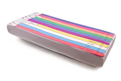
Sweet (and Savoury) Dreams

Ever dreamt about sleeping on a hot piece of toast, buttered sheet with a spaghetti dooner?

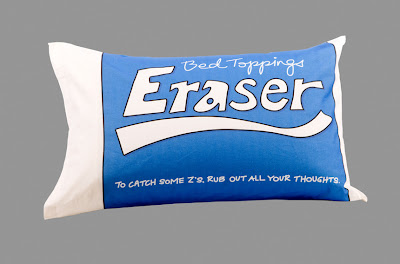
  Well that was the inspiration for Bed Toppings.


Australian designer Sophie Farquhar uses her own illustrations to create these super fun bed-scapes.


I love all of these - they all tick my design boxes.  Witty, colourful and good quality.


...Lets hope they do them in big-kids sizes soon!